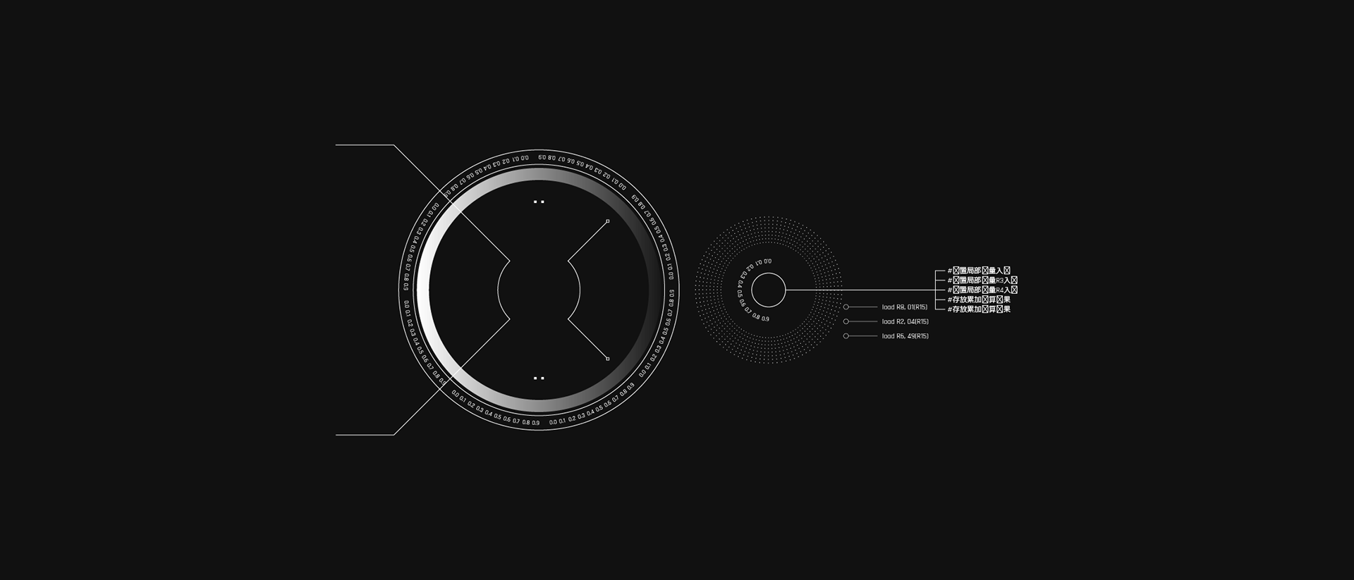
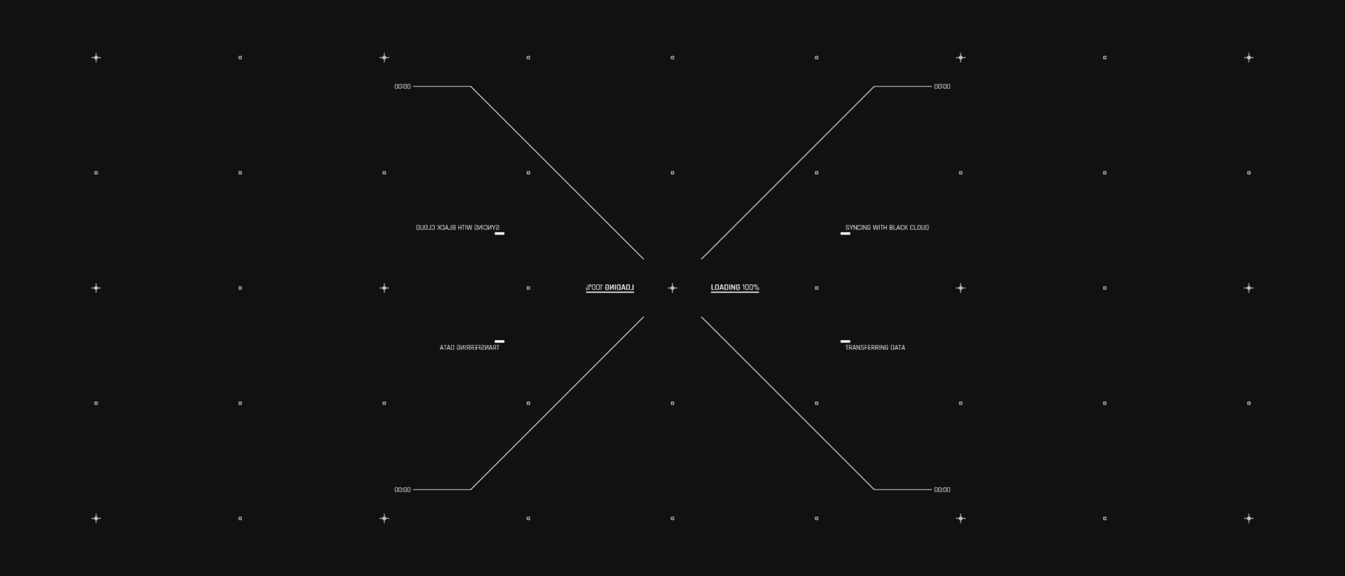
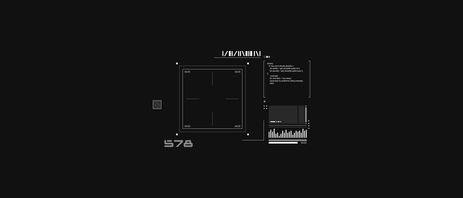
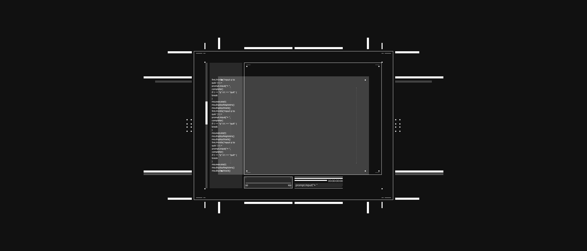
A core narrative of the movie is that all technology is owned and controlled by a single organisation: 'Egotechnics'. To support this concept the look and feel of the interfaces needed to be consistent.
I defined a grid system which would be the starting point for all my designs. This allowed me to design elements as modules and combine them to create complex pieces.
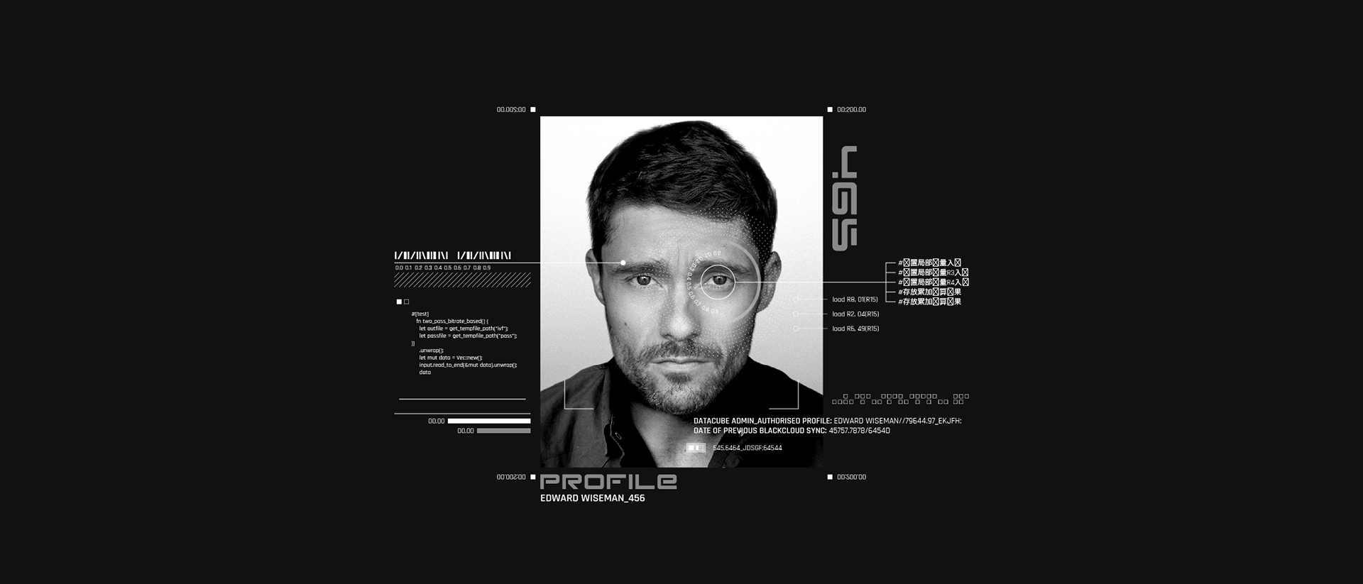
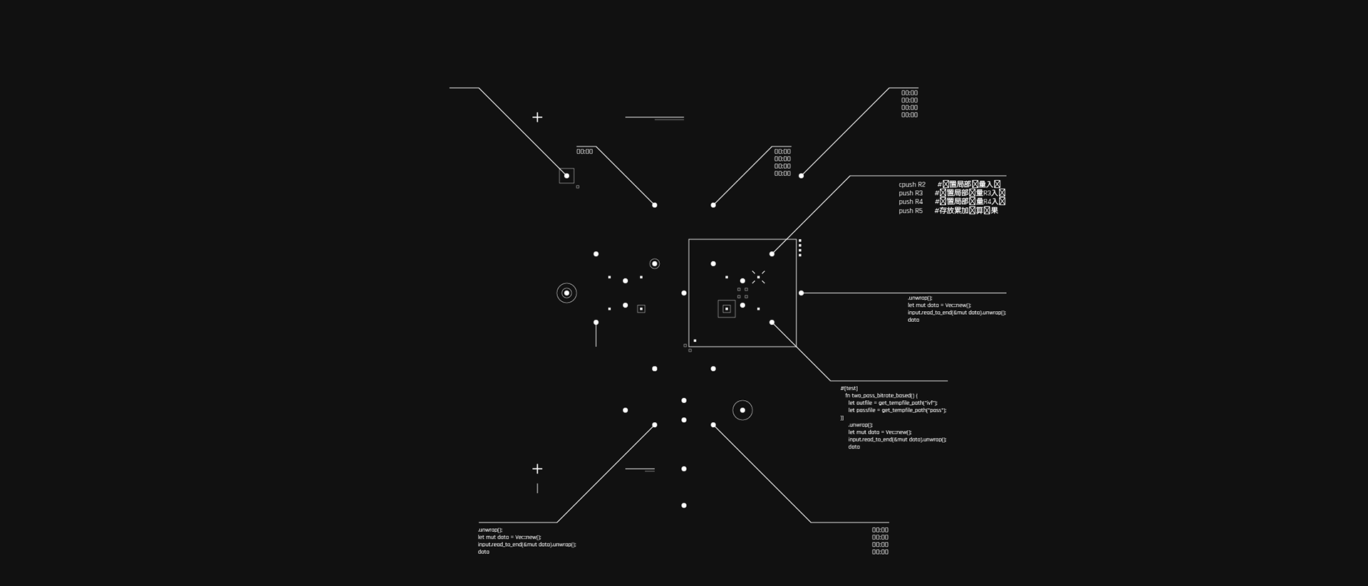

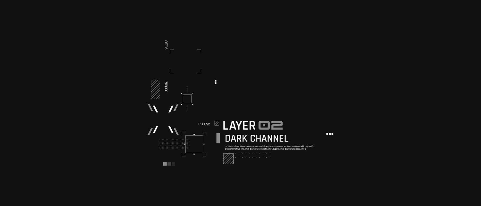
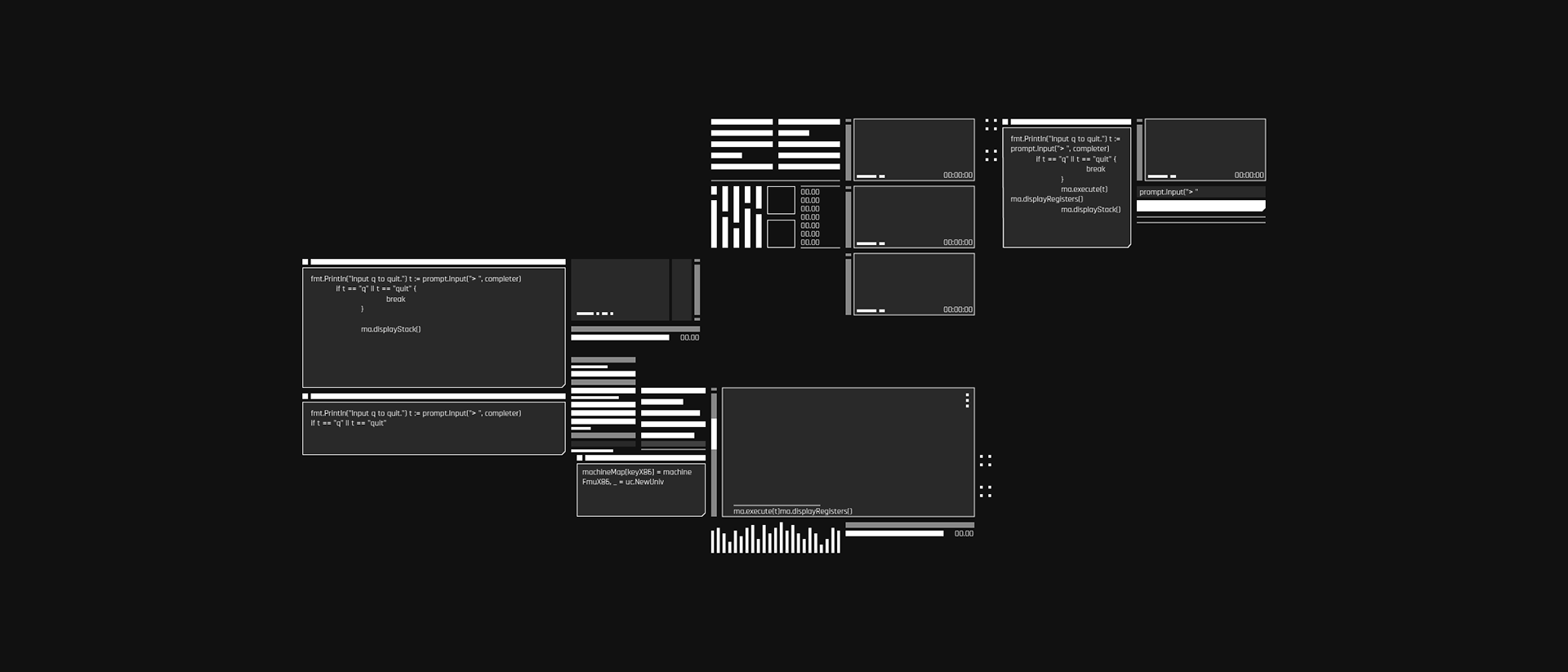
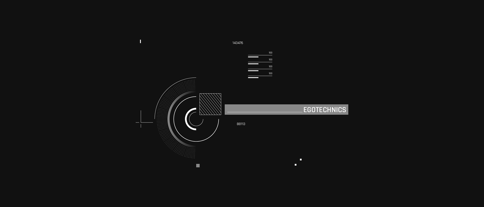
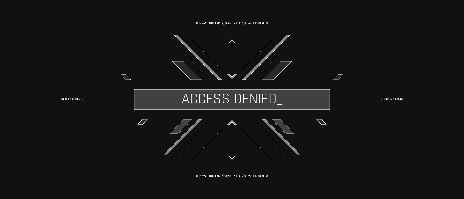
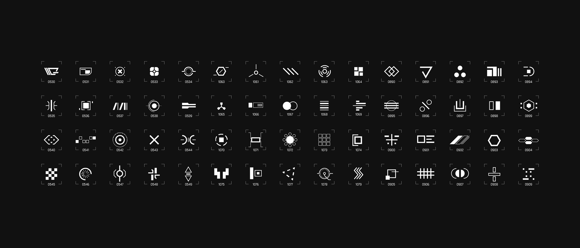
I wanted to go deeper into the world of Dark Channel and felt that Egotechnics would benefit from some branding treatment to help bring it to life. This visual identity would be displayed on city billboards and smaller tech devices and gives the impression of a powerful omnipresent force.
A custom display typeface was created for use in the Egotechnics word mark and various UI modules.