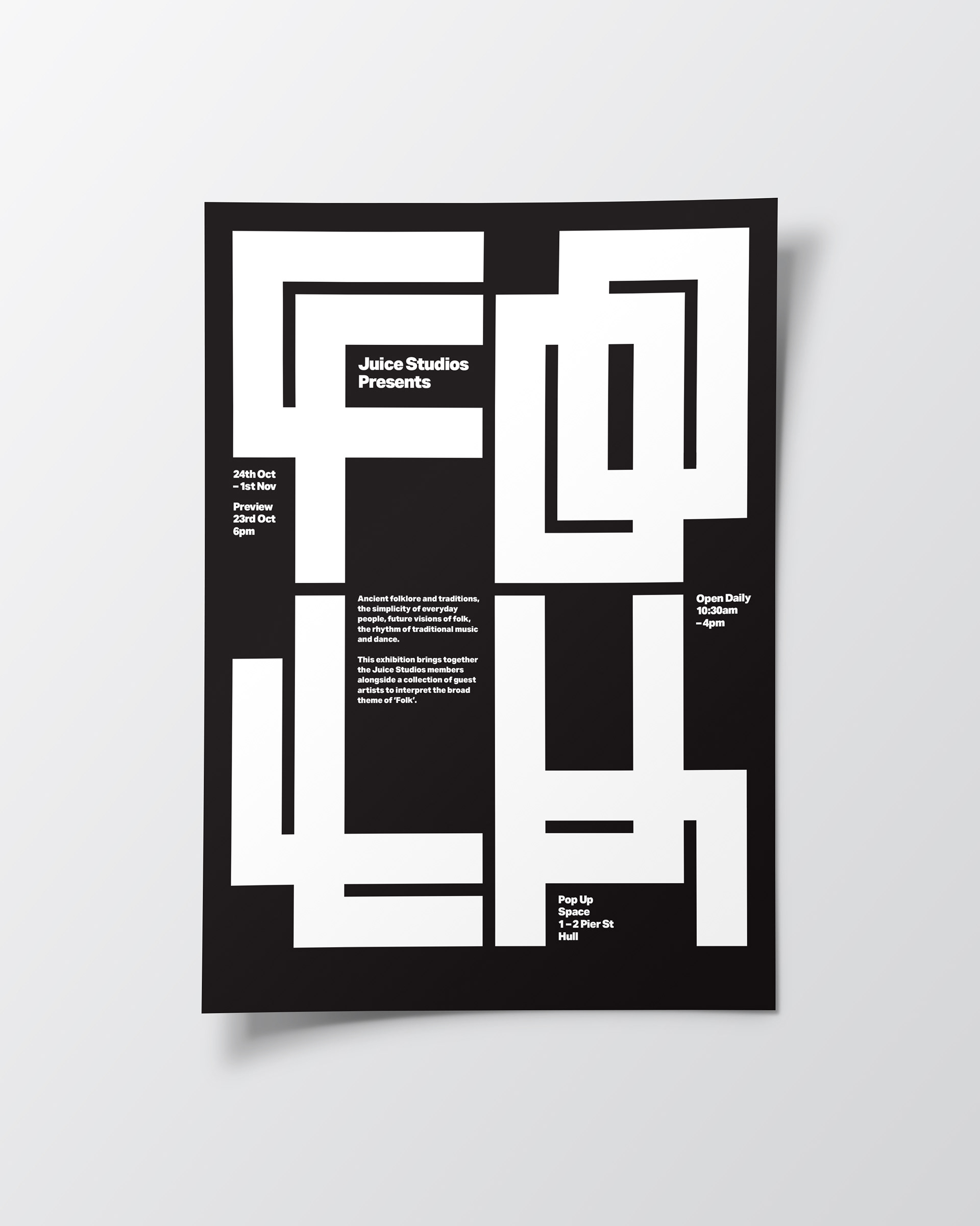
identity system for the annual exhibition by Hull based artist studio and workspace; Juice Studios. The theme for the exhibition is 'folk'.
The identity is used across social media and printed material.
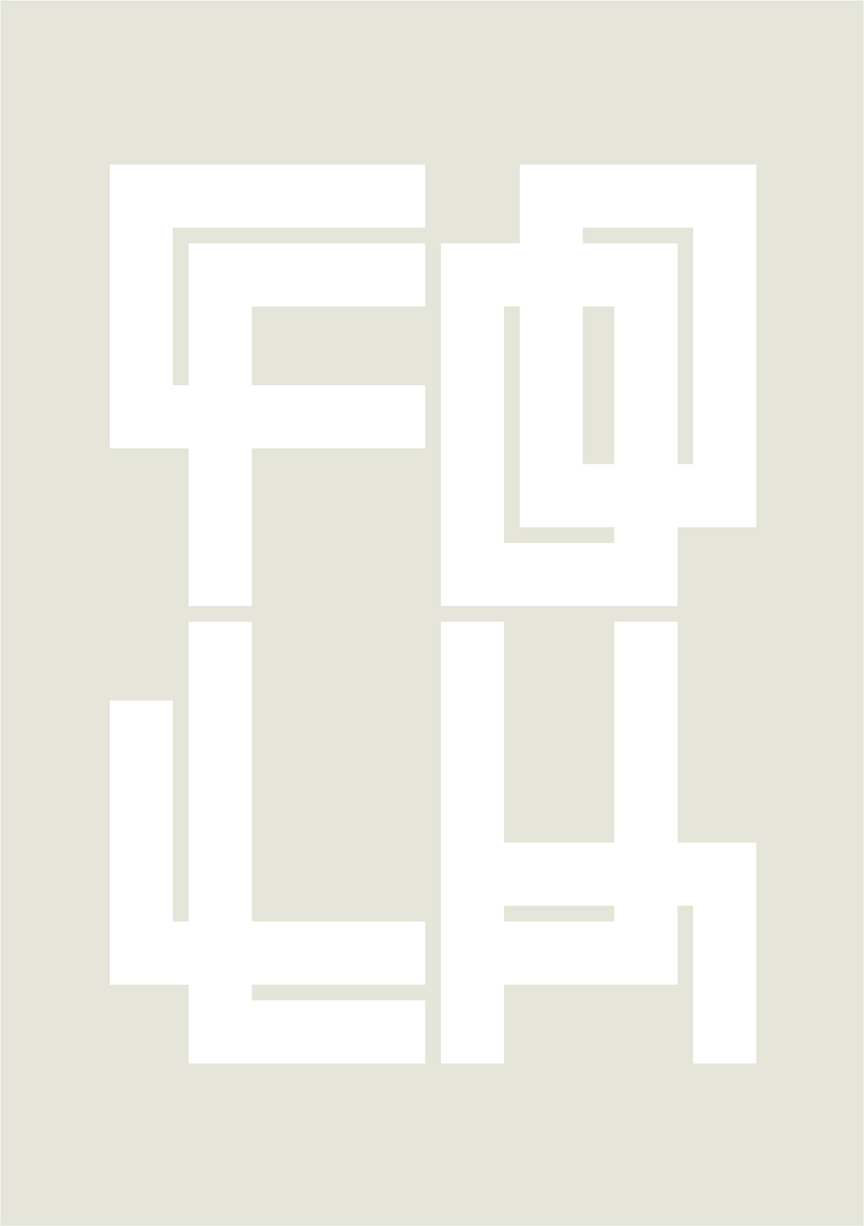
Inspired by gothic blackletter type, I designed a wordmark based on a modular typeface where each character was constructed of repeated strokes. The characters are built to a ratio of 5:7, closely matching that of ISO paper and mobile phone screen ratio.
When arranged vertically the wordmark acts as a framing device to display pieces from the exhibition.
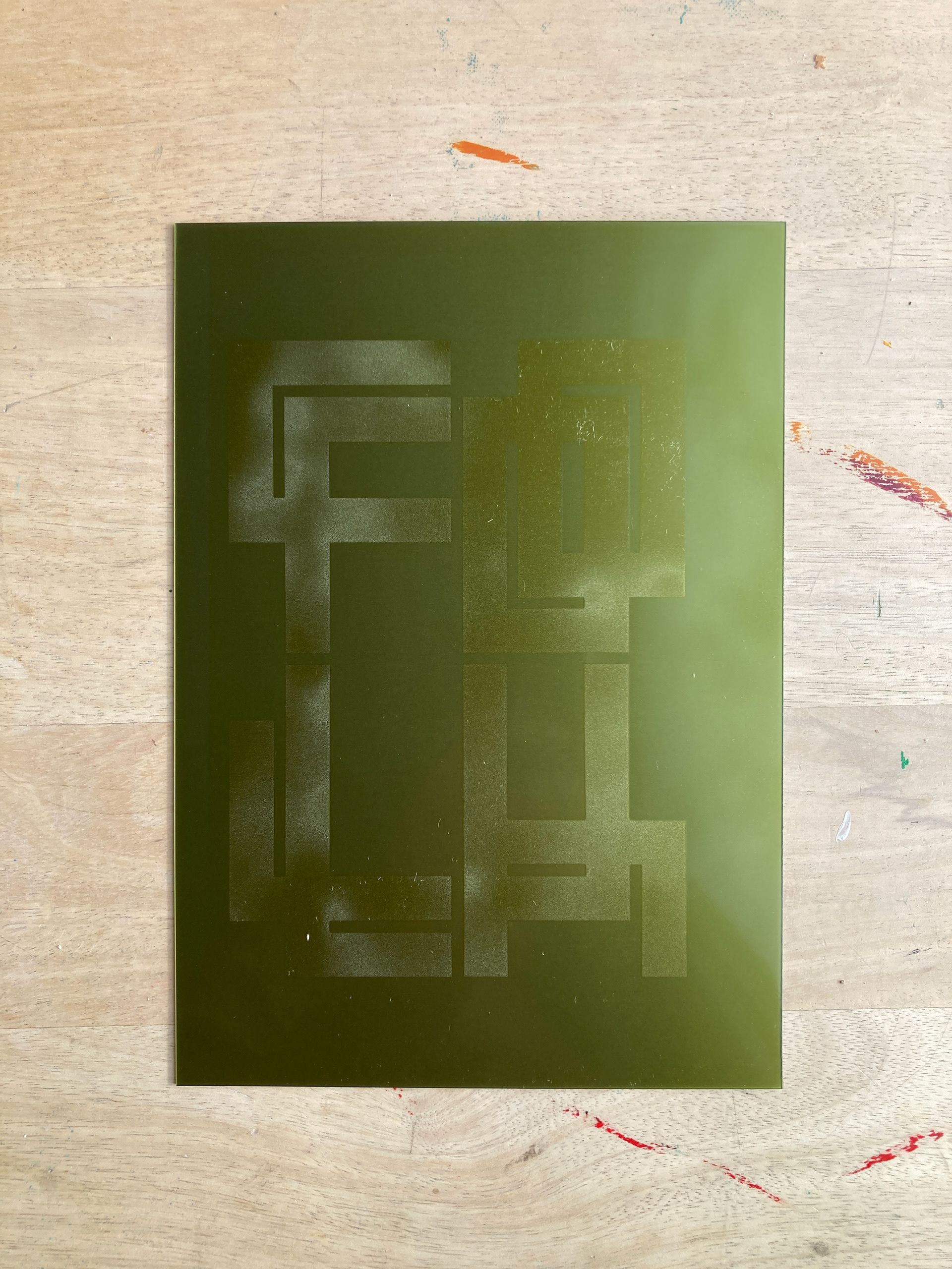
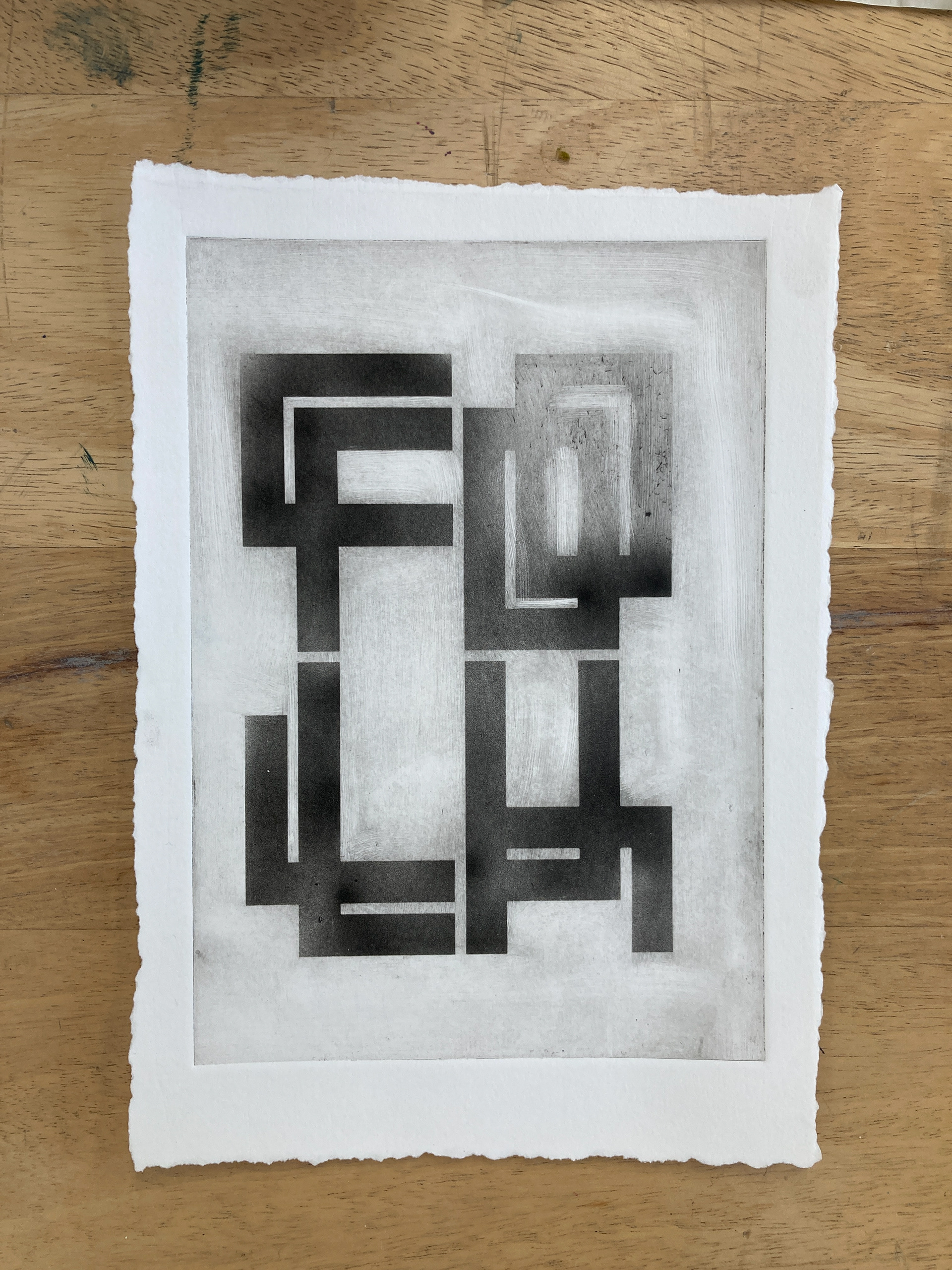
A motion piece was created for social media and several printed pieces were produced at various sizes using techniques including silkscreen, intaglio and solar etching.